A few simple settings adjustments can go a long way to improving the overall usability of iOS 7, whether running on an iPhone, iPod touch, or the larger screened iPad models. We’ll show you how to quickly boost the text size which can help to reduce eye strain, enable bolder fonts for easier reading of just about everything, make settings toggles more obvious, improve the general appearance of the home screen, and also how to reduce the likelihood of getting motion sickness from the parallax eyecandy.
1: Make the Text Size Larger
Though you’ve been able to make the font size larger throughout iOS for a while, it’s better controlled in iOS 7 and it’s a bit more important for readability due to the new default font choices. Even if you have great eyesight, boosting the text size just a bit can make for a nice improvement in appearance and also reduce eye strain.
- From Settings, go to “General” and choose “Text Size”
- Drag the slider to the right to increase the text size, watch the preview to see what the results will be
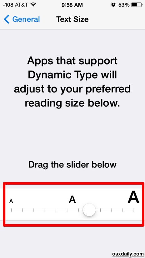
This impacts many apps, but perhaps two of the most important are Messages and Mail, which have pretty small fonts by default. Third party apps that use the Dynamic Type engine will also be affected by this setting.
2: Make All Fonts Bold for Easier Reading
iOS 7 really slimmed down the default text throughout the operating system, which for many of us makes it harder to read. Thankfully, it’s super easy to get the bold fonts back system-wide, all you need to do is toggle a setting:
- Open the Settings app and choose “General”, then go to “Accessibility”
- Flip “Bold Text” to ON
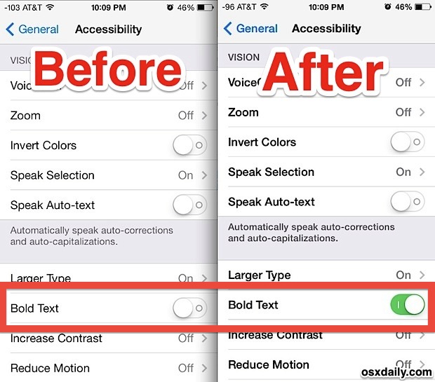
Toggling bold text causes a quick reboot, whereupon all text is then replaced with a much easier on the eyes bolder version. Don’t expect a super-thick bold weight, it’s fairly subdued and actually more closer to the default system font that existed prior to iOS 7.
3: Enable ON / OFF Labels
The settings toggle indicators rely on color now, with green indicating a setting is turned on and white indicating a setting is turned off. That’s troublesome for some users to comprehend though, and you can make it much more clear by adding a simple ON/OFF indicator label to all settings toggles:
- From Settings, go to “General” and then to “Accessibility”
- Look for “On/Off Labels” and flip the switch to ON
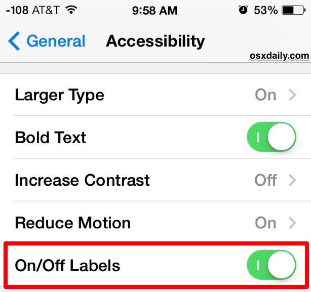
The On and Off labels use the ancient computing standard of binary 1′s and 0′s, with 1 demonstrating that a setting is on or enabled, and 0 showing that a setting is off or disabled.
This setting just makes things more obvious, it’s a good one for improving usability even for those who have no issues with color perception.
4: Use a Subtle Wallpaper
The appearance of iOS 7′s home screen, Dock, lock screen, Control Center, and Notification Center are largely dependent on the wallpaper that has been set on the device. That means the wallpaper matters much more so than usual in the overall appearance of things, so if you find iOS 7 to be garish to look at or hard to read at times, you may find that setting a more subtle wallpaper makes a major difference in the overall look and feel. This is particularly true with the home screen icons, where a bright and cluttered wallpaper can make the icons and text clash against the background and hard to identify. The screen shot below demonstrates this fairly well:
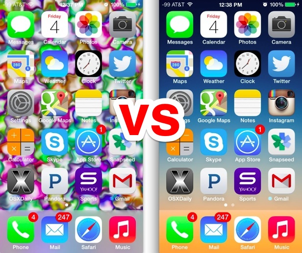
Subtle gradients and more abstract images look great as wallpapers in iOS 7, as do any image that isn’t particularly busy or full of clashing colors.
5: Reduce Nausea Potential By Turning Off Motion Effects
Some users have reported getting motion sickness from all the wild and fancy motion parallax and zoom effects throughout iOS 7, but you can reduce the motion effects through a simple settings adjustment. This won’t turn them all off (such a toggle may come in a future update though) but it is reported to help some who are nausea prone:
- From Settings, go to “General” and “Accessibility” to “Reduce Motion”
- Toggle Reduce Motion to ON
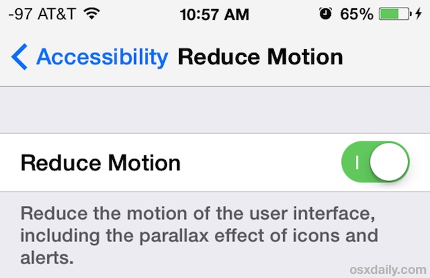
This is particularly recommended for iPad devices that are intended for use by young children, because the motion effects on larger screen seems to have a greater chance of effecting nausea, and because the youngest amongst us may not be able to fully understand why they suddenly don’t feel so great. Better safe than sorry, it’s never fun to feel ill! A nice little bonus is the potential to get battery life by cutting away some of the eye candy too.
-
Going further, you may find that some of the speed improvement tips can also help general usability too, if for no reason other than improving the general responsiveness of devices, particularly some older model iPhone and iPads.
Email this 5 Simple Usability Improvements for iOS 7 to a Friend! Receive Articles like this one direct to your email box! Subscribe for free today!

Tidak ada komentar:
Posting Komentar